Who is present?
The relationship map places people by observed presence in the chosen period. Filter by your labels or by change, then open a person to see their details.
PERSONAL DATA VISUALIZATION
A list remembers facts. A good view helps you ask better questions about them. Gravify starts with people, observed contact and time, and lets you move between the details and the larger pattern.
Find the right view ↓CHOOSE BY QUESTION
The relationship map places people by observed presence in the chosen period. Filter by your labels or by change, then open a person to see their details.
A linked timeline could compare months on the same scale. Select a month to inspect the conversations and recorded encounters behind a rise or fall.
A connected calendar view could put a new plan beside commitments you already have, so a choice is visible before you make it.
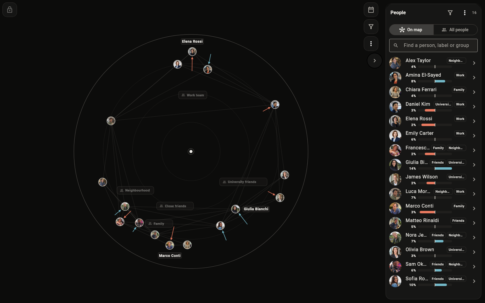
The relationship map is available in Gravify today. The other linked views above are planned.
A CONCRETE EXAMPLE
Choose March through May on the current map. Filter for increasing observed presence, then open a person. You can check the contacts Gravify saw and ask yourself whether the pattern matches your memory.
What the picture does not tell you is why contact changed. A missing source can also make the picture incomplete. The view is a starting point for investigation, not a score for friendship.
WHERE THE PRODUCT IS HEADING
Gravify is building more ways to combine people, messages, encounters, notes and calendar plans. The interactive homepage previews a map, a timeline and a calendar. Later, configurable comparisons and scenarios may help you test assumptions about what could happen next.
A forecast would be a model with limits, not a prediction about someone’s feelings or your future.
Try the view previews →KEEP EXPLORING
Take a closer look at the map, or see how a future agent could help set up a view without taking control away from you.